Evolution of a Homepage @ Coolibar (Magento 2)
As my first development position came closer to ending I was luckily able to complete one last project that I even impressed myself with!
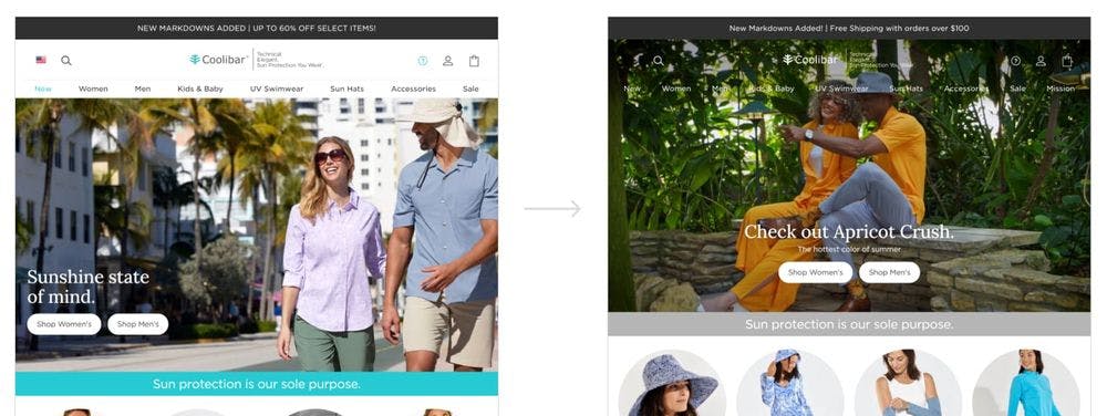
The project was an entire homepage redesign. Following that I was able to add an optional full browser hero video version with our navigation overlaying the video, making the video fit perfectly into desktop, tablet, and mobile views.
Homepage UX
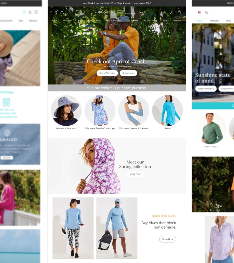
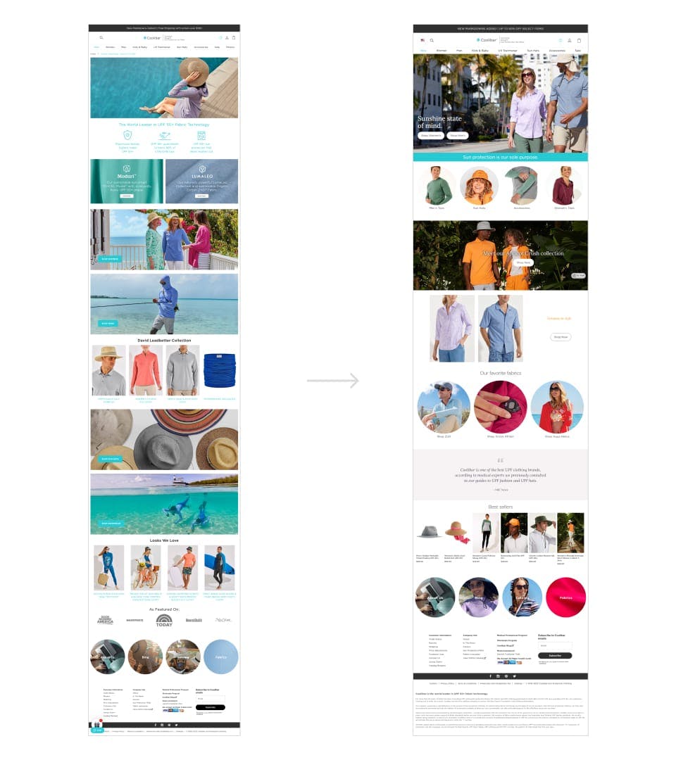
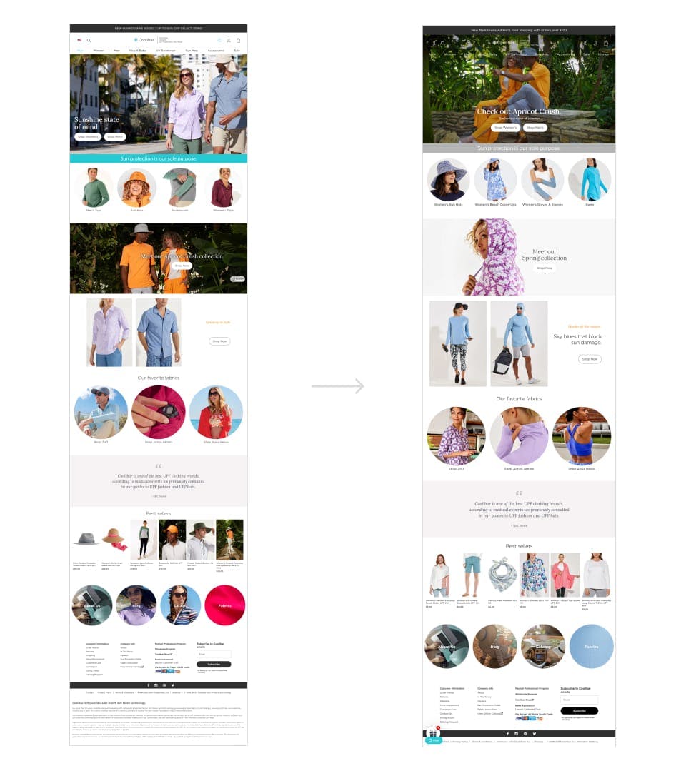
When I first arrived at the company the homepage didn't have much thought put into it. It was comprised of unoptimized images, a hero image with no copy, sections showing benefits of our fabrics that led no where, sections leading to poorly thought out or missing landing pages, and finally, more sections with large images and buttons that led to the same places that our main navigation already took users to.
Everyone on the creative team wanted to change this experience, so I decided to take the lead redesigning the homepage with the creative teams input, and then finally developed the entire new homepage myself.
Competitor examples
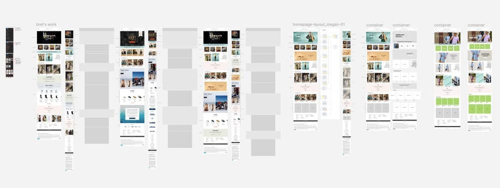
I asked everyone involved to find competitor examples that they believed worked really well. In our next meeting everyone presented their examples and explained what they thought worked well and why. After we all presented we then voted on all of the examples.
Layout and mockups
The next step was for me to take all of these examples and split them into sections that would work for our companies products and vision. These sections included most popular clothing categories, a fabric showcase, a marketing promotion area with promoted specific products below, a testimonials section, and a redesigned 'Best sellers' section.
With all of these defined sections along with the examples we voted on, I created a Figma project where all of us could 'frankenstien' together homepage examples to show in our next meeting.
Final design
The next meeting was focused on presenting the homepage examples we created and voting as a group on our favorites. This worked out extremely well. Because we all put so much thought in to the beginning of the project, we all felt our needs were being met by the examples we were able to spin up independently. Ultimately we decided and I was able to begin coding!
The development
The coding for this project went pretty quickly and was mostly comprised of HTML and CSS work. The 'Best sellers' section involved JS and working within the Nosto platform. The launch went well and we luckily had no issues or fire drills following it. We did make some small edits here and there, but nothing diverting from our chosen design. Success!
Homepage fullscreen video
Our marketing department came to my small team with a new video they were making to promote a clothing color 'Apricot Crush'. They wanted this video to take over the entire page on desktop, tablet, and mobile views. I was excited to take this project on!
Fullscreen video and navigation overlay
As stated above, we wanted the video to be fullscreen. No matter how narrow or wide the view, we wanted the page filled with. This meant our navigation needed to not have a white background and instead have a transparent background with all of the navigation content converted to white so it would be visible on top of the video. This design portion was simple enough. It was the coding that took some trial and error.
The development
Our e-commerce platform was Magento 2 and our video service was Vimeo. At first my entire team thought we were going to have to tinker with the navigation within Magento 2 and we were not excited about that because our timeline was too tight to risk possibly breaking the navigation in some way.
CSS really came to the rescue here. I was able to use only CSS to redesign/develop the entire homepage full screen video hero with our navigation overlaying it. It was nothing more than extremely well thought out CSS changes that gave us our final product. The personal success of pulling this off along with the internal compliments made my week!
That's a wrap
Thanks for reading!